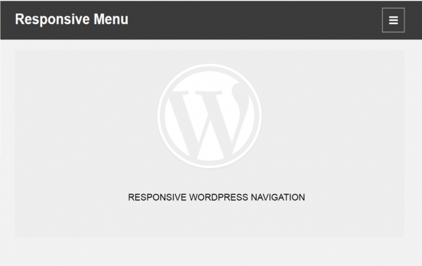
Responsive WordPress themes design is one of the growing trends in web design today. Web designers no longer talk of ‘web design’ but ‘screen design’. Web design has changed over the years due to the emergence of smartphones and tablets. As tenets of responsive web design requirements, every website should be visible in a wide range of screen sizes.
When designing WordPress themes you should put into consideration that the users will use different gadgets to view the website. You should therefore incorporate the ability for mobile users to view content easily. One of the most important aspects of user interface design is navigation. WordPress themes menu, in particular, should be designed to be mobile-friendly.
Getting Started with Responsive Navigation
The majority of WordPress themes released today are built upon a responsive framework like Twitter Bootstrap or Foundation Framework. These responsive frameworks utilize CSS media queries to target different gadget screen sizes and display the website appropriately. Personally, I like building WordPress themes based on Twitter Bootstrap since am adherent of the cliché ‘no need to reinvent the wheel’. Having said that, I will explain in detail how you can build responsive navigation in WordPress.
In this tutorial I will be illustrating how to build responsive navigation in an existing WordPress theme, I will be using Twenty Sixteen theme for illustration purposes.
Step 1: Create a child theme
Create a child theme inside the wp-content/themes folder and name it twentysixteen_child. Add a style sheet inside the new theme folder and import the parent theme CSS in the new style sheet. The complete file should look something like this:
/*

Theme Name:     Twentysixteen Child

Theme URI:     http://theme4press.com

Description:   Child theme for Twentysixteen for tutorial illustration

Author:        Joe Njenga

Version:       1.0.0

*/

/ *
Import parent theme style sheet
*/
@import url("../twentysixteen/style.css");
The Twentysixteen child theme has now been created but you need to add the functions.php and the index.php files for it to be functional;
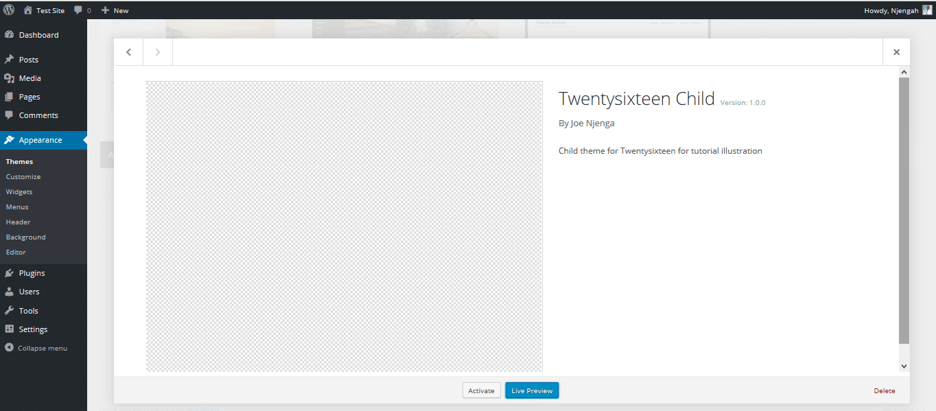
You should also not forget to add index.php and function.php files inside the child theme folder. Secondly, while creating a child theme you should always remember that all the content of the parent theme can be copied on the child theme except the functions.php file. You should instead create a new function.php and include any files you wish to as follows;
require_once( get_stylesheet_directory() . '/your-file.php' );
The reason for this restriction is the fact that both files (functions.php) are loaded and the child precedes the parent. Ideally, your new functions for creating responsive navigation should be made in the child theme’s function.php file.
Step 2: Editing viewport in the header.php file
Since not all themes are coded in the same way, it’s important you check your theme header.php for the viewport metatag. In most older and nonresponsive themes it should look something like:
<meta name="viewport" content="width=device-width" />
You should change it to;
<meta name="viewport" content="width=device-width, initial-scale=1">
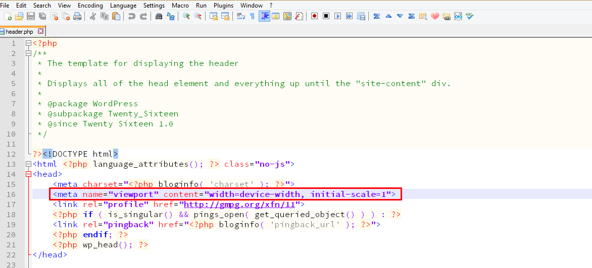
This viewport tag is important for instructing web browsers on the way they should control the dimensions and scaling of a web page.
Step 3: Registering Responsive Navigation
Now we should begin working on the new function.php file, the first task is to register the new responsive menu as follows;
function twentysixteen_child_responsive_menu() {
register_nav_menu( 'primary-res-navigation', __( 'Tutorial Responsive Navigation', 'twentysixteen_child' ) );
} add_action( 'after_setup_theme', 'twentysixteen_child_responsive_menu' );
I created this function to register the new responsive navigation and named it ‘Tutorial Responsive Navigation’, here I used the register_nav_menu WordPress function. I went ahead to hook into WordPress action hook after_setup_theme then called the function name twentysixteen_child_responsive_menu
The results of registration of this function are the availability of a newly created menu in the WordPress dashboard Appearances > Menus > Manage Locations. See the screenshot below:
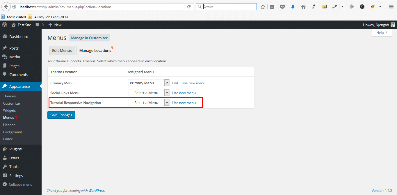
It’s time now to create our responsive navigation, go to WordPress dashboard and under Appearances > Menus create a new menu and add the menu items as shown below;
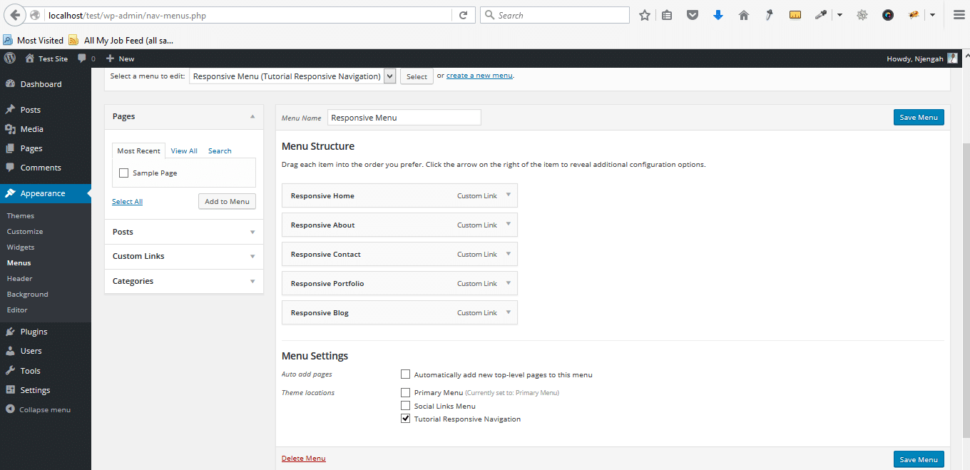
After adding this menu we should now go ahead and display it on our child theme.
Step 4: Adding Navigation Location in header.php (display menu on the theme)
We now open the header.php file and locate the wp_nav_menu then below it we should now call the responsive menu using the code below;
<?php wp_nav_menu( array( 'theme_location' => 'primary-res-navigation', 'menu_class' => 'responsive-navigation' ) ); ?>
This simply adds the menu to our header and also generates the HTML class for our menu which we will use for styling purposes. In this case our HTML class is .responsive-navigation. After adding this code the menu should now be visible on our theme.
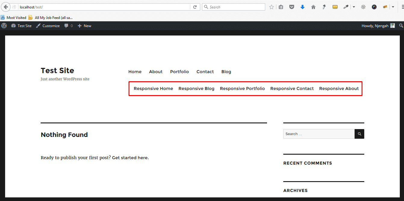
Step 5: Styling Responsive Menu
It is important we note that this new responsive navigation should only be visible for people using mobile gadgets. We should there disable view on the desktops, to implement this we add the following CSS line:
.responsive-navigation {
display:none;
}
This alone will not work since it will disable the view of this menu across all the gadgets. It is at this point that media queries mentioned earlier in this tutorial become very useful. We, therefore, target the screen size of 480px as the point in which we wish to display this menu;
.responsive-navigation {
display:none;
}
@media only screen and (max-width:480px) {
.responsive-navigation{
display:block;
}
}
When you have added these CSS styles you will notice that the responsive menu above disappears when you are viewing from the desktop. You can mimic the mobile browser view by scaling your desktop browser view, on Windows press CTRL+ on Mac CMD +. You will also see that both menus are displayed;
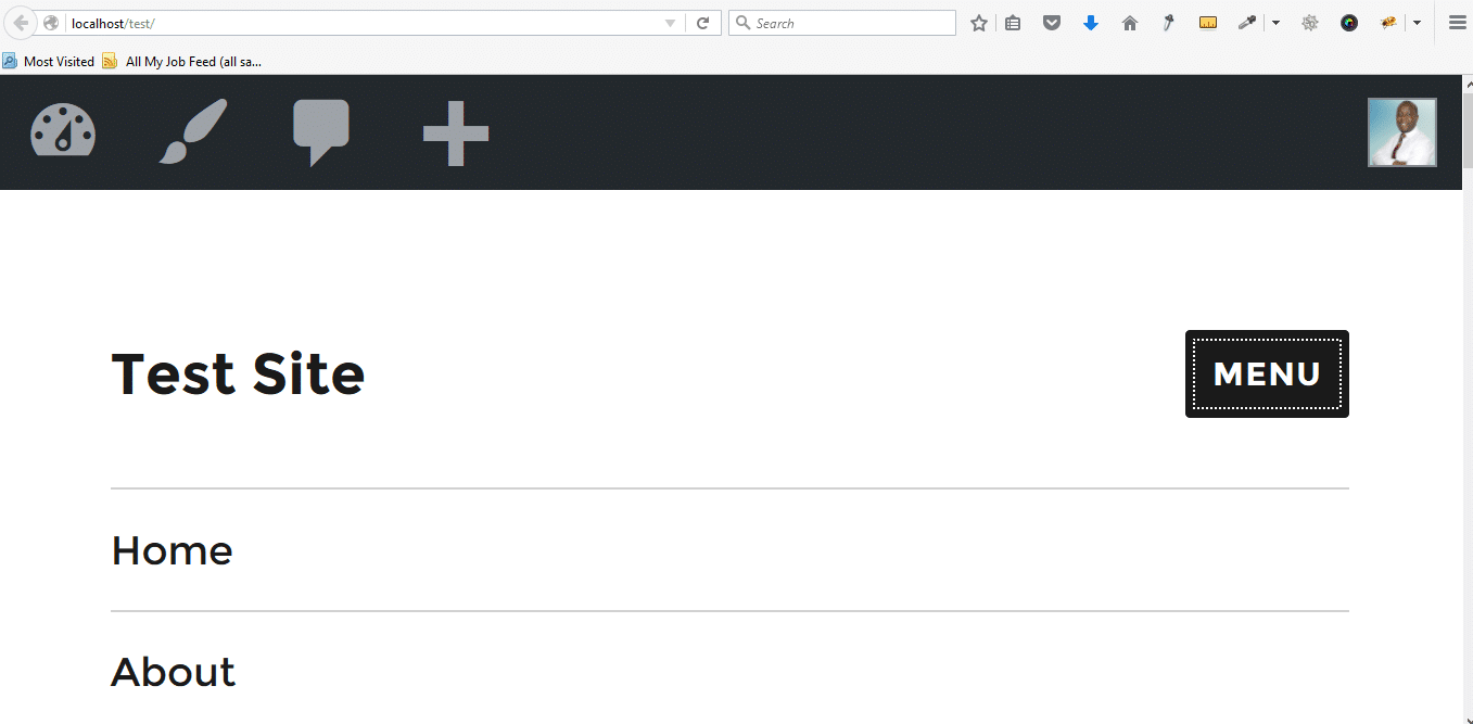
We now need to ensure the desktop menu is not displayed on mobile. We simply add this CSS rule inside the media query;
.primary-menu {display:none;}
Here is the complete code with some additional styling to make the menu look good;
/* Styling Tutorial Responsive Navigation */
.menu-responsive-menu-container ul > li {
border-bottom-color: #999;
border-bottom-style: solid;
border-bottom-width: 1px;
}
.responsive-navigation {
display:none;
background-color: #ddd;
padding: 20px;
}
@media only screen and (max-width:480px) {
.responsive-navigation{
display:block;
}
.primary-menu{display:none;}
}
Here is the final result of this styling;
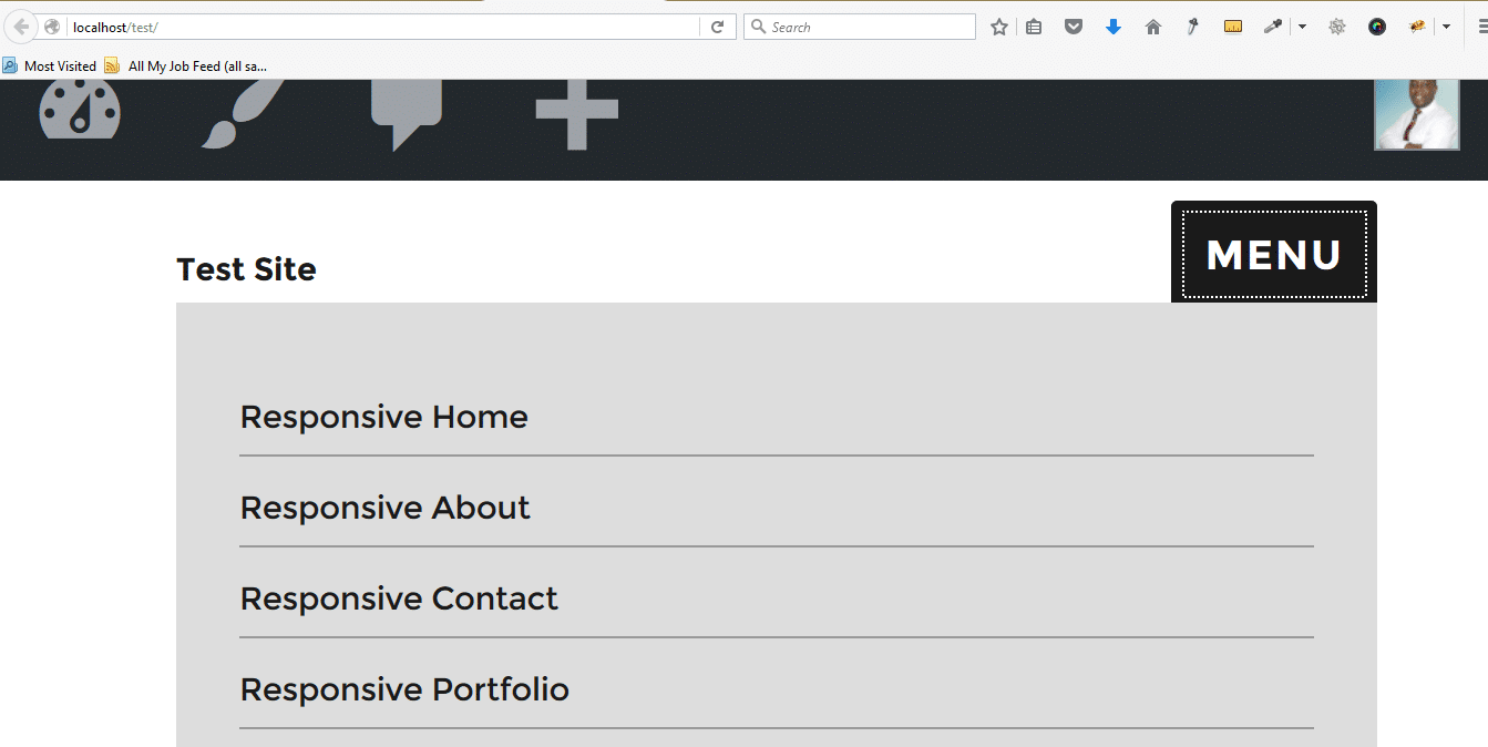
Finally, we have successfully created a responsive WordPress navigation on our child theme that is working perfectly. It is important to note that this can be done on any other theme by following the steps outlined in this tutorial. Please let me know if you have any questions, compliments, or additional remarks using the comment section below, your feedback is highly welcomed.

Hello,
Thank you for the great tutorial. How can one make the two (2) menus (Primary Menu and Tutorial Responsive Navigation) to be responsive together?