Giving images shadows can add a nice little extra bit of styling that makes your site stand out.
As long as they aren’t too obvious, they can be a design element that almost goes unnoticed to the conscious eye, but they add to the overall feel of the site.
In WordPress, unfortunately, you can’t get shadows on images out of the box.
But it doesn’t take a lot to get them if you know how to apply a little bit of CSS.
We’ll go over how to do that below.
Add New Class to Image Code
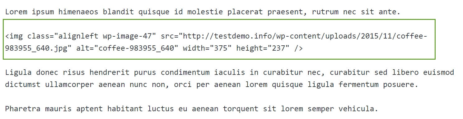
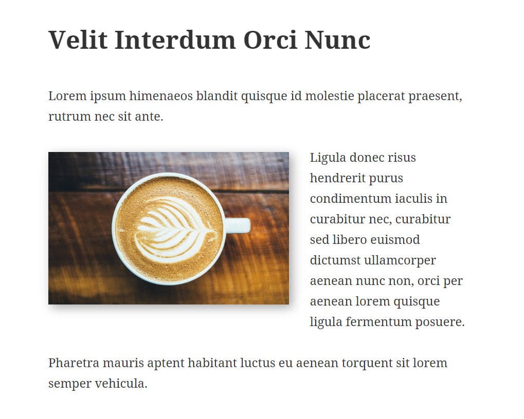
To apply a shadow to an image, first insert the image into your post as you normally would.
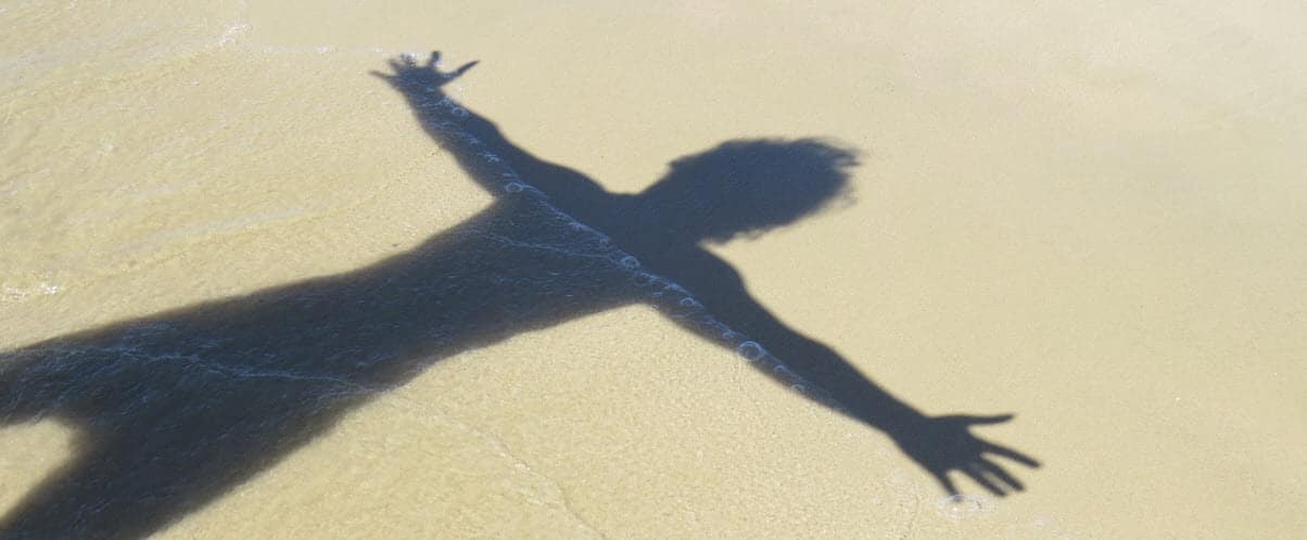
Here’s the image I’ll be working on within my example

Next, go into the “Text” view of your editor so that you can apply some coding. We’re going to add a CSS class to the existing image code.
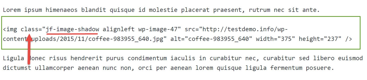
In my example, I’m going to call my class “jf-image-shadow”. You want to make sure your class is something unique so that it doesn’t conflict with any other possible CSS classes already in your theme (or even classes that may be added later by a plugin).
As the name “image-shadow” seems pretty common, I just added my initials (jf) to the front of it to make it unique.
When you go into your Text view, you should see the code for your image already there.
Add your new class name to the section that says class=“…
Here’s mine.
Add CSS to Stylesheet
Next, you’ll need to put the following CSS into your style sheet (Appearance > Editor > Stylesheet – style.css). As it’s best to not change your original theme, you should either make a child theme or use a custom CSS plugin.
Here’s the code we’ll be working with. We’ll go over what all of it means in a minute. But for now, let’s see how it works.
.jf-image-shadow {

box-shadow: 5px 5px 5px  rgba(0, 0, 0, 0.35) !important;

}
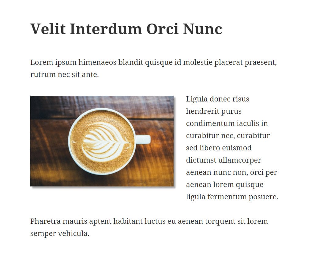
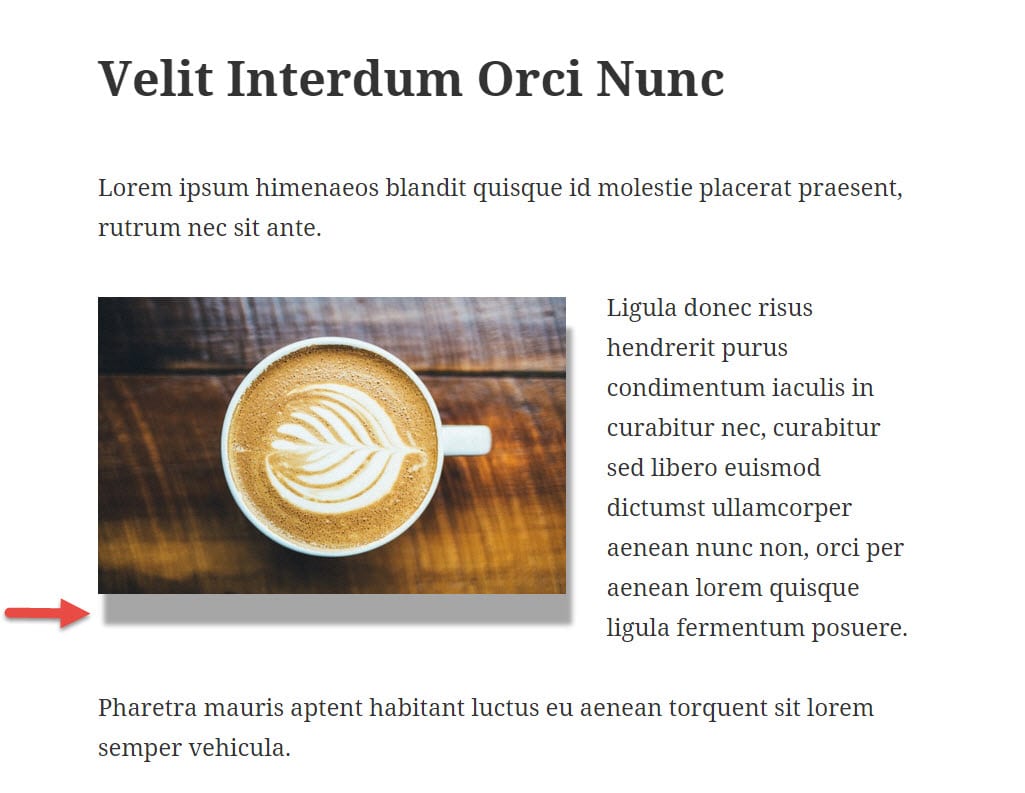
And this is what that looks like for me.
Customizing Your Code
So the code above will give you a nice-looking shadow like the one I have, but you can also customize that code if you want yours to look different.
Let’s go over what the different parts of the code mean so that you can do that.
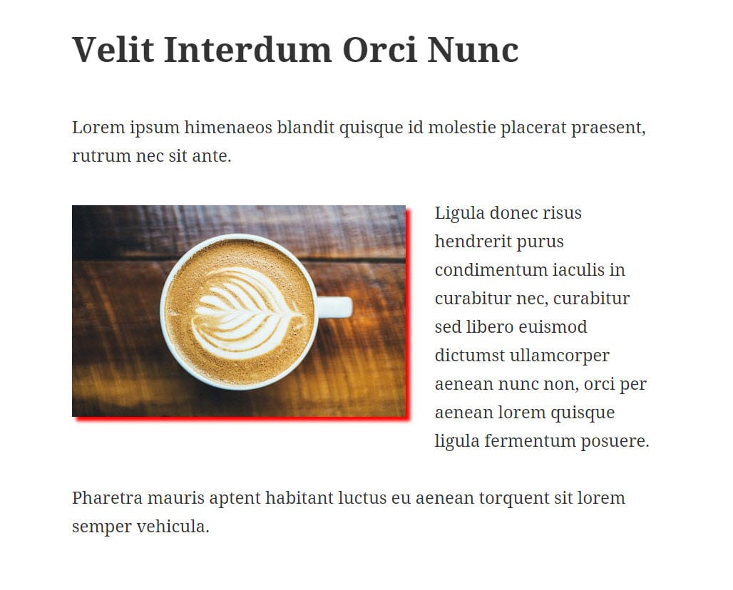
Horizontal
The first number in my code (the first 5px) is for the horizontal position of the shadow. To show you how that works, I’m going to exaggerate the horizontal position and make it 25px instead of 5px.
You’ll see that dramatically extends the horizontal shadow aspect.
.jf-image-shadow {

box-shadow: 25px 5px 5px  rgba(0, 0, 0, 0.35) !important;

}
Vertical
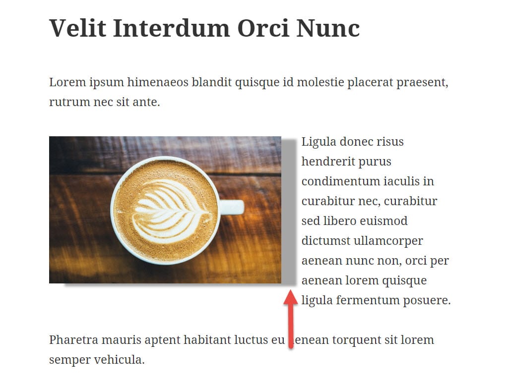
The second number (the second 5px) is for the vertical position. If I exaggerate that to 25px, you’ll see how that works.
.jf-image-shadow {

box-shadow: 5px 25px 5px  rgba(0, 0, 0, 0.35) !important;

}
Blur
The third number is for the “blur” of the shadow, i.e. how sharp the shadow is vs. how blurry it is. When it’s blurrier, it’s softer.
I’ll now make that one 25px.
.jf-image-shadow {

box-shadow: 5px 5px 25px  rgba(0, 0, 0, 0.35) !important;

}
Color
The next section is the color: rgba(0, 0, 0, 0.35).
RGBA is only one type of color that you can use. You can also use hex, like #000000. You could even just use a word if you wanted, like “black” or “red.”
I used rgba here because the final number (0.35) lets me control the opacity. You can’t do that with hex.
You can find resources on the web for colors to let you get the right one for you.
But as an example, let me just put in the color “red” so you can see how it affects the shadow.
.jf-image-shadow {

box-shadow: 5px 5px 5px  red !important;

}
!important
And finally, you’ll notice the !important section at the end. That just tells the web browser that this piece of code is more important than any other piece of code that might be present in your site that talks about applying a box shadow.
And that’s it. Shadows are pretty easy, and they can add a nice little extra bit of pop to your site.
No Comments Yet