
Creating buttons in WordPress would seem to be the job of a theme or a plugin. And those can be good options.
But it’s also easy to create your own buttons in WordPress with a little CSS. And once you create the initial code, it’s easy to add your own buttons where you like.
We’ll look at how to do that below.
Add a Link to Your Site
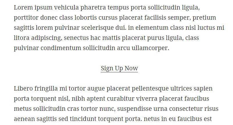
The first thing you’ll want to do is to add a link to your post or page as you normally would.
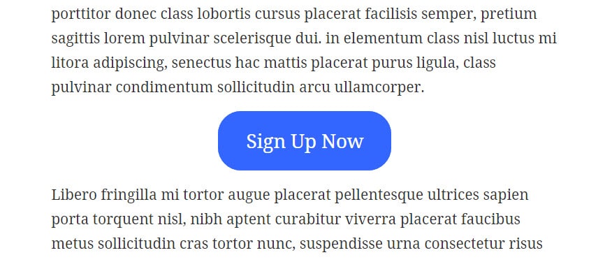
Let’s say you want your button to say “Sign Up Now.” So you just add a link that says that and you can position it where you like.
In my case, it looks like this.
Add a Class to Your Link
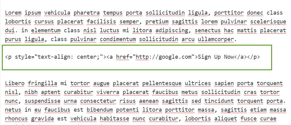
Next, you’ll need to go into the code section of your page (i.e. the “Text” section) and add a class to your link.
First, find the code for your link. Here’s what mine looks like.
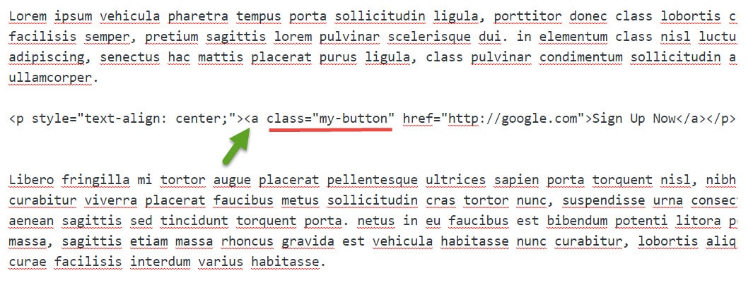
Next, add a “class” to your link code. Give your class a unique name so that it doesn’t conflict with any other classes that might already exist in the CSS of your site.
In my case, I named my class “my-button”. Make sure to add it to the link code – i.e. inside the section that begins with <a.
Add Your CSS
Next, you’ll want to add your new CSS. As this changes your theme, you should probably either create a child theme or install a custom CSS plugin so that when your theme is updated, your changes won’t be lost.
Here’s the CSS I’m going to add. We’ll talk about what all that means in a minute.
a.my-button {

line-height: 1.8em;

font-size: 25px;

color: #fff;

background-color: #3366ff;

border: 2px solid #3366ff;

border-radius: 10px;

padding: 20px 35px;

-moz-transition: all 0.8s;

-webkit-transition: all 0.8s;

transition: all 0.8s;

}
a.my-button:hover {
background-color: #fff;
color: #3366ff;
border: 2px solid #3366ff;
border-radius: 10px;
padding: 20px 35px;
}
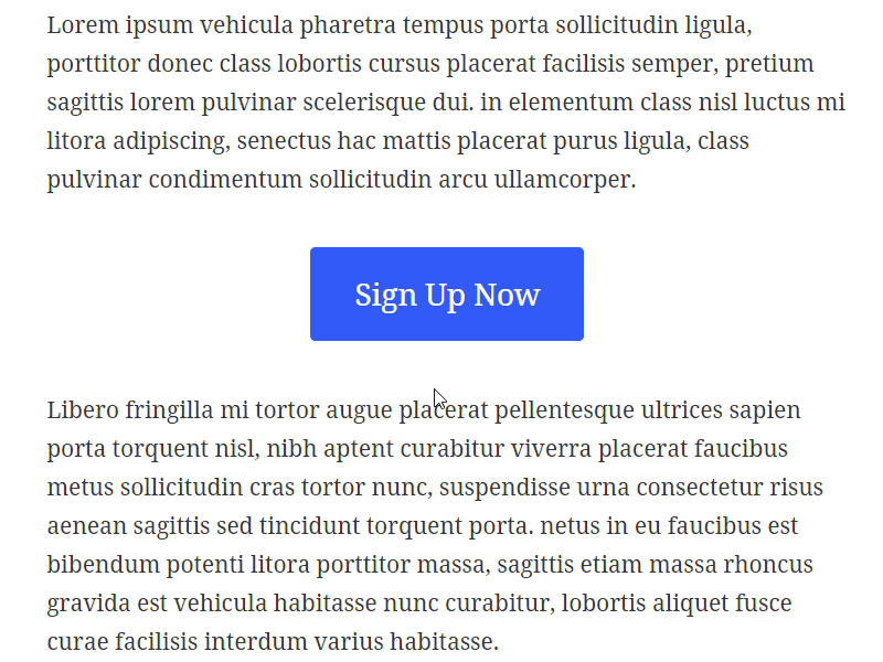
And here’s how that comes out on my site - a nice button with a hover effect.
Customizing Your Button
You can customize this CSS code as you like. We’ll run through what some of it means.
The first section of code determines what the button looks like without any hover effect – i.e. before someone mouses over it.
The line-height gives height for your text, and the font-size is the size of your text, of course.
The color is the color of your text. In my case, it’s white starting out. Then it changes when it’s hovered over it. So that will be controlled by the next section of CSS.
The background color and border are self-explanatory.
The border-radius gives the button a rounded look. If you increase that, it will get rounder. For example, let’s say I increased that from 10px to 30px. It would look like this.
The padding controls how much space is around the button text. The first number (20px) is the space above and below the text. The second number (35px) is the space to the right and left of the text.
The three different transition numbers control how fast the button changes colors. The higher that number, the longer the transition. (There are three different lines to account for different web browsers.)
The Hover Section
The second section controls what the button looks like once it’s hovered over.
All that should now be pretty self-explanatory if you’ve gone over the info above.
It’s important to remember to change the colors here if you want your button to change colors. For example, I started with a blue background and white text, then on the hover, I simply reversed that, with a white background and the same blue text.
You might, for example, not want to change the background color, and only change the text color on hover. If that’s the case, you can just delete the background color in that section.
Buttons are Easy
Simple buttons like this are easy. Once you get your CSS code down, you can just add a class to whatever link you like.
And of course, you can also make different buttons to suit different needs.
Have created a button. Where exactly in the txt do you add your example to create the button you example? And is it as you have written it but with no space between the two sections. Thanks, hope that is clear.
a.my-button {
line-height: 1.8em;
font-size: 25px;
color: #fff;
background-color: #3366ff;
border: 2px solid #3366ff;
border-radius: 10px;
padding: 20px 35px;
-moz-transition: all 0.8s;
-webkit-transition: all 0.8s;
transition: all 0.8s;
}
a.my-button:hover {
background-color: #fff;
color: #3366ff;
border: 2px solid #3366ff;
border-radius: 10px;
padding: 20px 35px;
}