
If you've ever seen cool-looking circular/rounded images on a site and wanted to get them on your own site, it's actually not that hard to do.
Of course, you could always make your images rounded in an image editor and upload them, but then there's no going back if you do it that way.
Instead, you can simply manipulate your images with a bit of CSS.
And so that's what we'll do below.
Squares and Rectangles
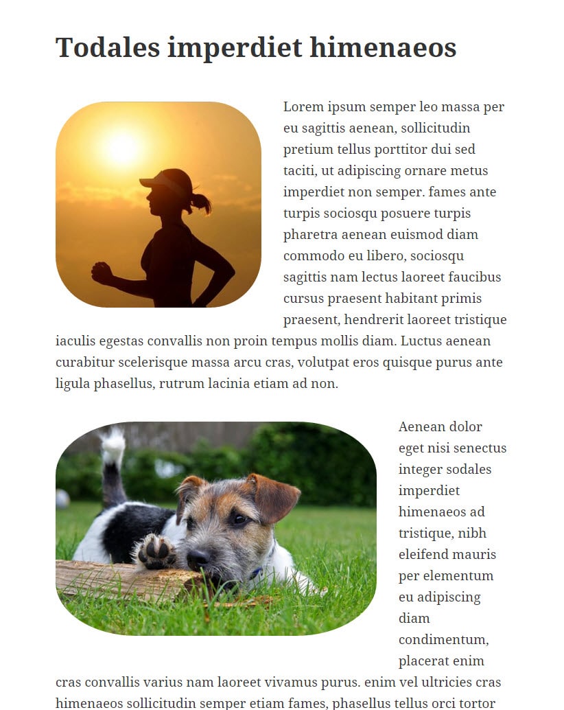
The first thing to talk about here is that if you use a certain type of CSS (i.e. percentages), then it will affect the images differently according to whether they are square to begin with or rectangular.
In other words, an image that is originally square will easily turn into a perfect circle.
But an image that is originally rectangular will turn into an oval if using percentages in your CSS.
Later we will talk about turning rectangles into a perfect circle as well, but first, let’s take a look at using percentages with the two types of images.
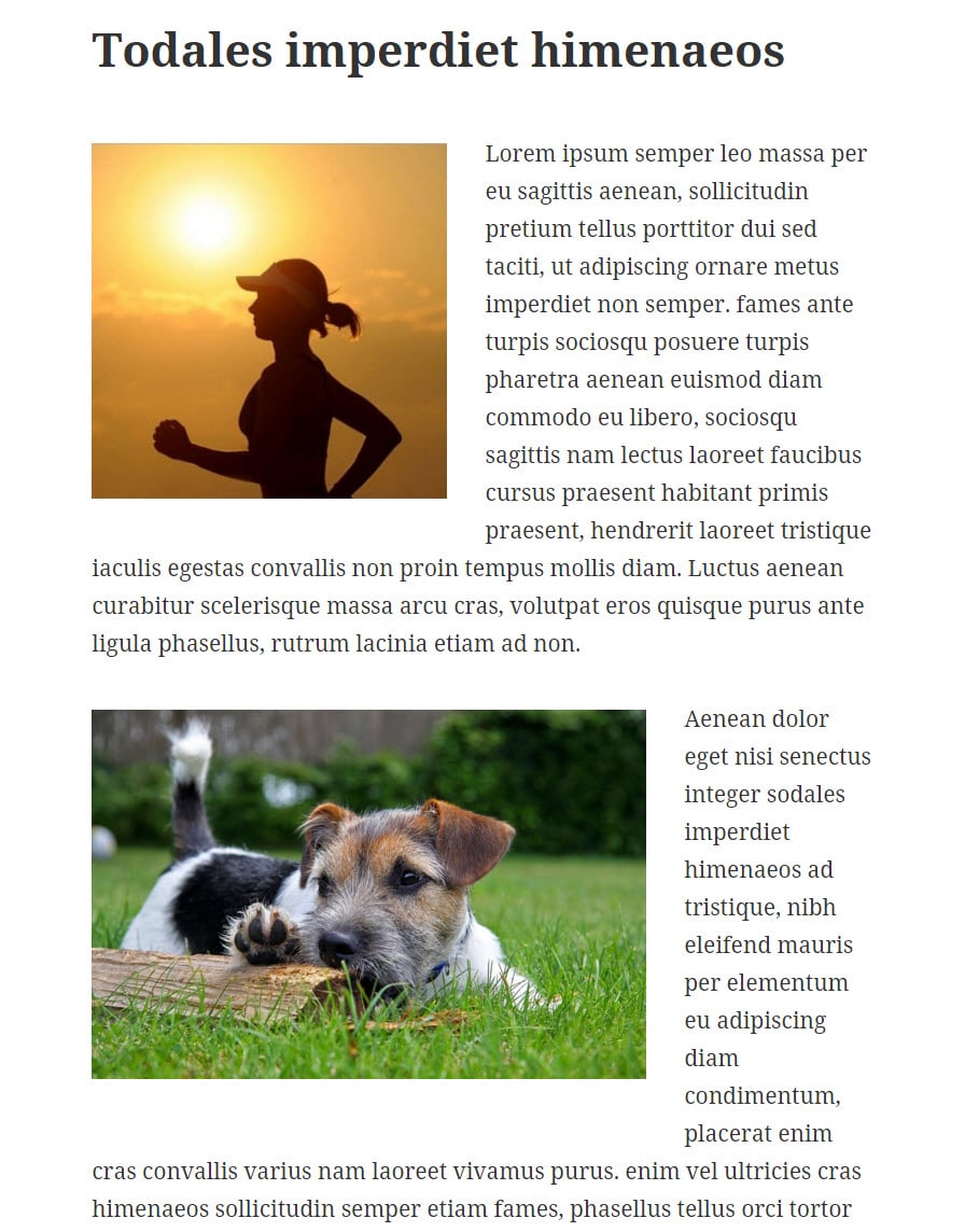
Here are the two images I’ll originally be starting with – one a square and the other a rectangle.
Making a Circular Image with CSS Percentages
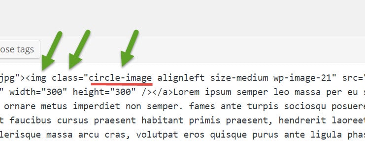
So to apply CSS to our images, you’ll just have to upload them as you normally would to your post. Then you’ll need to go into the code view (i.e. the “Text” view) on your editor and give them a new CSS class.
In my example, I’m going to call my class “circle-image”.
If you’ve uploaded your image into your WordPress editor, then it should already have an image class section in the code. You’ll just need to add “circle-image” to that section.
As you can see in the screenshot below, I’ve just stuck “circle-image” inside the class section of the image tag.
Next, you’ll need to put the following CSS into your style sheet. As it’s best to not change your original theme, you should either consider making a child theme or using a custom CSS plugin.
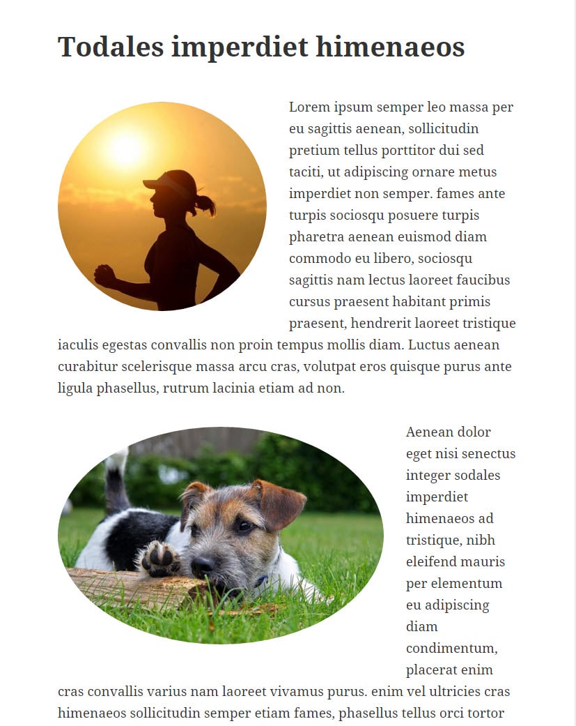
We’ll start by using the following CSS:
.circle-image {

border-radius: 50%;

-moz-border-radius: 50%;

-webkit-border-radius: 50%;

-o-border-radius: 50%;

}
And so here’s how that affects the two different images.
You can also play with the percentages to get different looks. For example, if we bumped the 50% down to 10%, we’d just get slightly rounded corners.
.circle-image {

border-radius: 10%;

-moz-border-radius: 10%;

-webkit-border-radius: 10%;

-o-border-radius: 10%;

}
And bumping that 10% up to 25% will give you even more rounded corners, but still not circular.
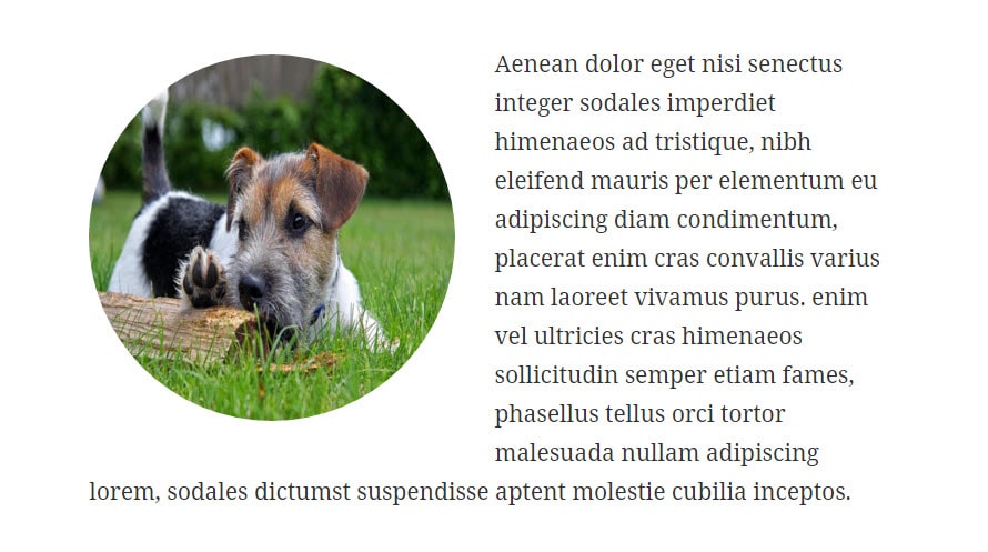
Make Rectangles Square
To make a circle out of a rectangle, using the percentage method is not the simplest way to go.
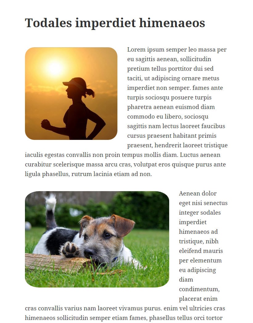
The easiest way to go is the use definite pixel measurements.
You can make the image whatever size you like (provided the original is big enough), but the key here is to set your radius to be one-half of whatever you set your width and height to be.
For example, you’ll see in the code below that I’ve set the width and height to be 300px. As I want this to round off to a perfect circle, that means I have to set my radius numbers to be 150px.
.circle-image  {

width: 300px;

height: 300px;

-webkit-border-radius: 150px;

-moz-border-radius: 150px;

-ms-border-radius: 150px;

-o-border-radius: 150px;

border-radius: 150px;

}
And here’s how that came out.
Being aware of the Image’s Center
It’s important to note that no matter which version of CSS you use, it will always be targeting down to the center of your image. And so if you have a person over onto the side of the image, they will get cut off. So be conscious of what’s in the center of your original image if you start to round the corners off.
I am unable to give them a new css class.
Thank you for the code. I used it on my site to change the gravatar image to circular.