Irrespective of whether you're designing any standard website or a magazine-style site, it's important that your readers can access your website information easily and quickly. However, getting access to the information is only half the battle won. Put simply, just making your site content accessible is not enough, it's also important that it is readable and looks aesthetically pleasing to the reader's eye.
Let's explore some of the most important typography elements that play a crucial role in creating effective typography:
Avoid Using Too Many Typefaces
The first and foremost objective behind effective typography is the clarity with which the content is being displayed. However, some of us make use of too many typefaces on the website. Doing so may make the content appear cluttered and unappealing to the eye. Moreover, a reader may get confused while reading some text.
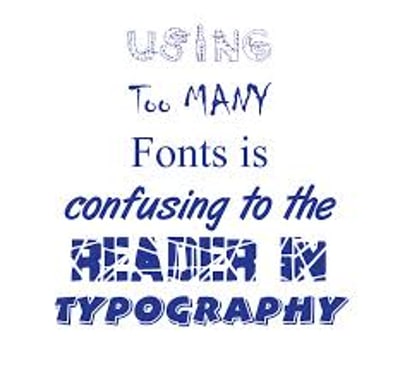
It's better to use only two typefaces – where one typeface is used for writing the headings and the other one for the body text. This means you should delineate hierarchy; that is outline how your page elements are arranged using two separate fonts.
Choose the Correct Font Size
If you can't differentiate between your site's main point and body text, perhaps your users will move on to some other page of your site, or rather choose to visit some other website. However, headlines really need to be worked out, as they help in getting a hold of the reader instantly. Put it simply, we often want to give priority to key information, and thus you need to be careful about assigning the correct font size.
For instance, writing your blog post's main heading (or title), let's say, “Typography Elements” will make it hard to read and look unprofessional to the reader's eye. Body text is usually written in 12pt size, while the heading should be assigned 16pt size.
Making Right Colors Choices with Correct Contrast
When choosing the font color, the color choices and contrast should be given due importance. That's because making the wrong color choices or choosing colors with the wrong contrast leads to poor readability and even causes eye fatigue, and your great content and CTA (call-to-action) may get ignored.

Now as you can see in the above screenshot, the text with grey colored background has low contrast making it difficult to read. On the other hand, the text with white-colored background with high contrast is easily readable. Thus, it's imperative for you to choose the right color choices (be it text or background color) with the right contrast that makes the text easy to read.
Spacing Matters
Apart from color contrast, spacing is another vital typography element that needs your consideration. Make sure that the text lines or words/letters in the text aren't placed too close together or too far, as it makes the text difficult to read. So, pay heed to three space elements – leading (that is spacing between lines of text), tracking (to control spacing in between the letters and words), and kerning (to use correct spaces between text characters).
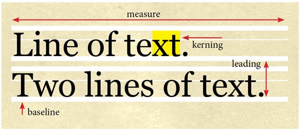
Also, opt for the right alignment of the main heading and body of text. Avoid justifying the text, as it may hamper word and letter spacing thereby making it hard to read a certain line of text.
Get Inspiration From Typography Examples
One of the best ways to learn how you can create effective typography is to surf the web for some great typography examples. You can find lots of helpful articles or posts related to typography and its key aspects. Looking at the examples you'll find inspiration on creating effective typography that looks pleasant to the eye.
However, make sure to consider a few bad typographies as well. That's because it will help you determine what might not work when producing typography examples.
Use Aesthetically Pleasant Typography
Do you believe that typography is limited to writing headlines and body of text beautifully? Well, then you should think of it as an art or a design element. Since typefaces are designed with scrupulousness and possess an aesthetic appeal, and hence, using the right typeface probably can prove to be a valuable asset to your website. But it goes beyond using typefaces with letters, rather you can think about giving a few tweaks to the typefaces to spice up their looks.
This key point best fit your need of creating an aesthetically amazing logo, where you can try adding few blotches, swirl or other things to change the structure of the fonts you're using. For example, look at the screenshot below and you'll observe Amazon.com’s logo.

Well, the logo is subtle yet it looks fabulous. The arrow added to the bottom of the logo makes it look appealing to the eye.
Conclusion
The above-discussed key points will most likely help you create good typography. Understanding the significance of the aforementioned basic typographic elements and applying them correctly to your web designs will help to enhance the readability of your reader.
No Comments Yet